
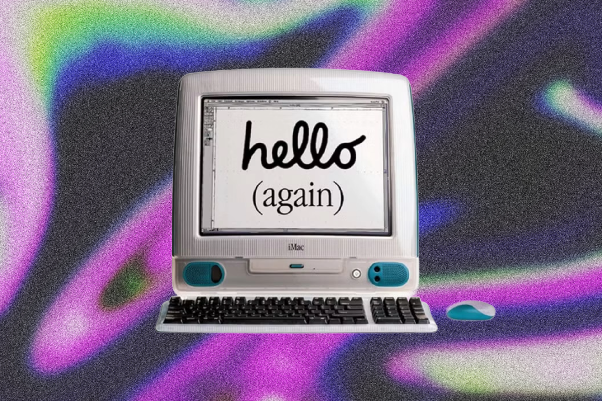
On Y2K’s candy-colored casings, the disappearance of visible technology, and our renewed obsession with a future that never quite arrived as promised.
Once upon a time, the future was translucent.
It came in Bondi Blue, Atomic Purple, Tangerine, Ruby Red, and Lime, with scarcely a sharp edge in sight. Instead, it glistened with smooth curves, glossy finishes, visible circuitry, and the surreal optimism of a world on the brink of an irrevocable transformation it didn’t yet understand but could endlessly imagine.
In the late 1990s, the publicly accessible internet was entering the American mainstream, and the prospect of an increasingly digital world was at once exciting, mysterious, and unsettling. Millennial product design’s characteristic transparent tech, jewel-toned gadgets, and “blobjects” made that strange, largely speculative future feel bright, playful, and approachable.
Nearly three decades later, the now-retro aesthetic has resurfaced across fashion, design, interiors, accessories, and tech culture: see-through speakers, candy-colored computers, translucent handheld consoles, and transparent earbuds. Sony has announced translucent controllers and console covers. Even retro music formats and their requisite equipment have become trappings of a broader millennial revival.
Perhaps, beyond simplicity and self-expression, today’s revival of the Y2K era reflects a desire to return to—and finally collect on—the bright, optimistic promise of a future that the period’s clear, curvilinear, candy-colored hardware sold us but never quite delivered.
“Once upon a time, the future was translucent.”
Up close and personal
It’s August 1998. The public internet is still young, and beige, corporate-feeling equipment remains the familiar face of personal computing. In 1997, 36.6 percent of American households owned a computer and 18.6 percent had online access; an increasingly digital world was taking shape, but everyday participation in it remained far from universal.
Announced in May and released on August 15, its translucent, circuitry-revealing shell, colored casing, organic curves, and promise of simplified setup gave the personal computer an unusually expressive form. Conceived by Apple’s industrial design team under Jony Ive, the all-in-one desktop marked a departure from the beige towers and businesslike equipment that had long defined the category. The inaugural G3’s bulbous Bondi Blue enclosure exposed aspects of the machine’s internal construction, while its curvilinear, self-contained form made it feel approachable—it even had a carrying handle.
That detail mattered beyond its practical function (in fact, at nearly 40 pounds, the iMac G3 was hardly portable). In a 2014 interview, Ive explained that the handle communicated a physical relationship with the object: “I can touch it, move it, it’s not too precious.”
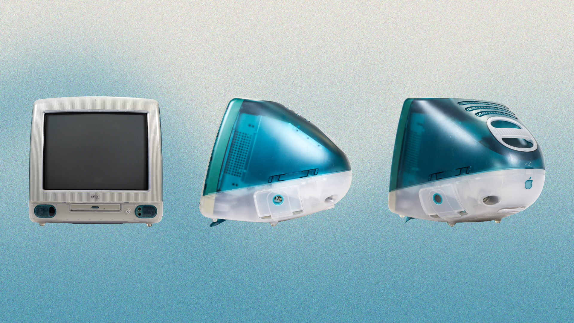
Apple’s iMac G3 in Bondi Blue, introduced in 1998. Its translucent enclosure and rounded silhouette gave the personal computer a conspicuously playful identity.
Photographs by Stephen Hackkett, via Wikimedia Commons, licensed under CC BY-SA 4.0. Editorial illustration by Ava Tichenor.
In January 1999, Apple expanded the G3 line to five fruit-inspired colors: Blueberry, Strawberry, Tangerine, Grape, and Lime. Its marketing, for the first time industry-wide, treated a computer’s look and feel as meaningful purchasing considerations, noting that, for many consumers, these mattered more than the technical specifications ordinarily associated with buying one.
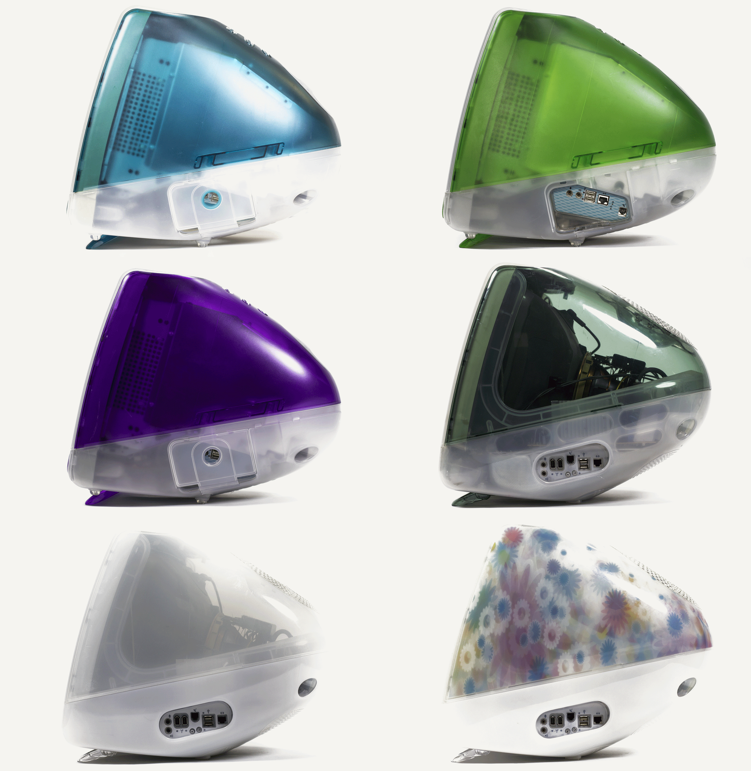
All thirteen colors of the iMac G3. Photo animation by Stephen Hackkett, via Wikimedia Commons, licensed under CC BY-SA 4.0.
The advertising made that proposition explicit. Apple supported the original iMac with an iconic $100 million launch campaign, which included TBWA/Chiat/Day television spots and billboards bearing tongue-in-cheek phrases, like “Chic. Not geek” and “Sorry, no beige.” In Apple’s 1998 “Three Steps” commercial, Jeff Goldblum narrated the process of connecting to the internet, only to discover that there was no third step. The campaign positioned the computer as friendly, fashionable, and freethinking, and the campaign was clear in its messaging: irreverent about computing convention, reassuring about the prospect of participating.
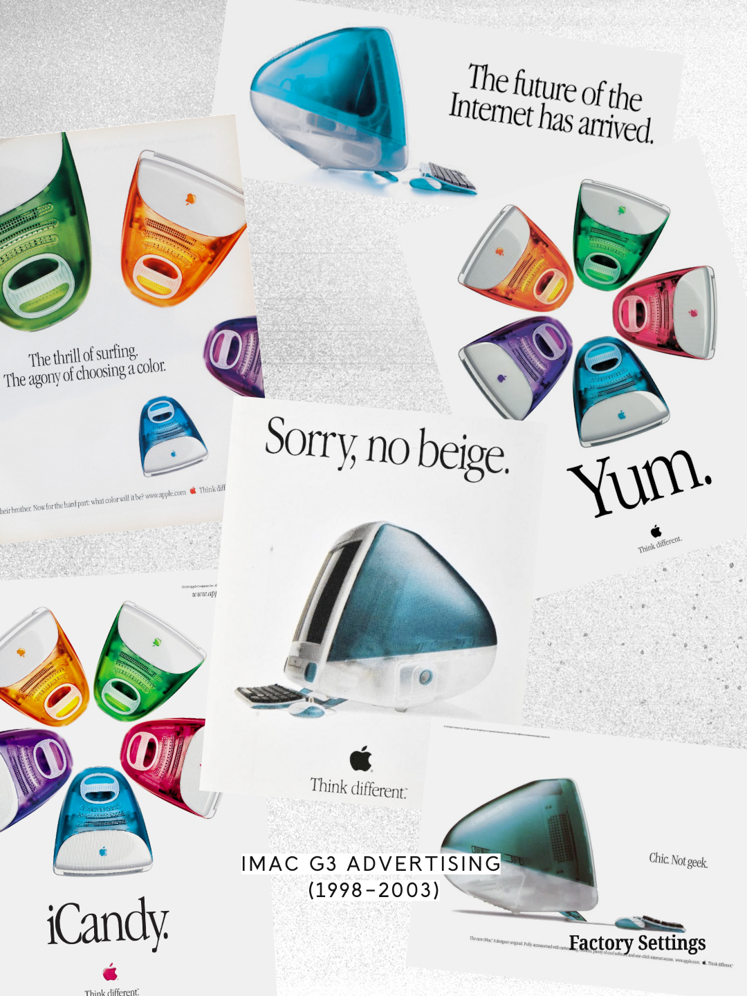
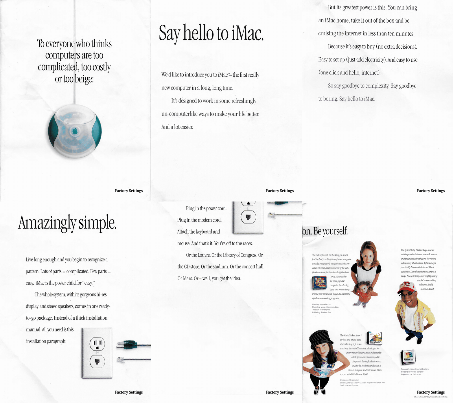
With the release of the G3’s fruit-colored models, that reassurance acquired an unabashed appetite. “Yum,” “iCandy,” and “What’s your favorite flavor?” borrowed the language of the confectionery, while a 1999 television spot choreographed the colorful computers to the Rolling Stones’ “She’s a Rainbow.” Choosing a computer became an occasion to exercise taste, and the digital future acquired a gleeful seduction akin to that of sweets on display in a candy shop.
The philosophy was preposterously simple: personal technology should feel… well, personal.
A look under the hood
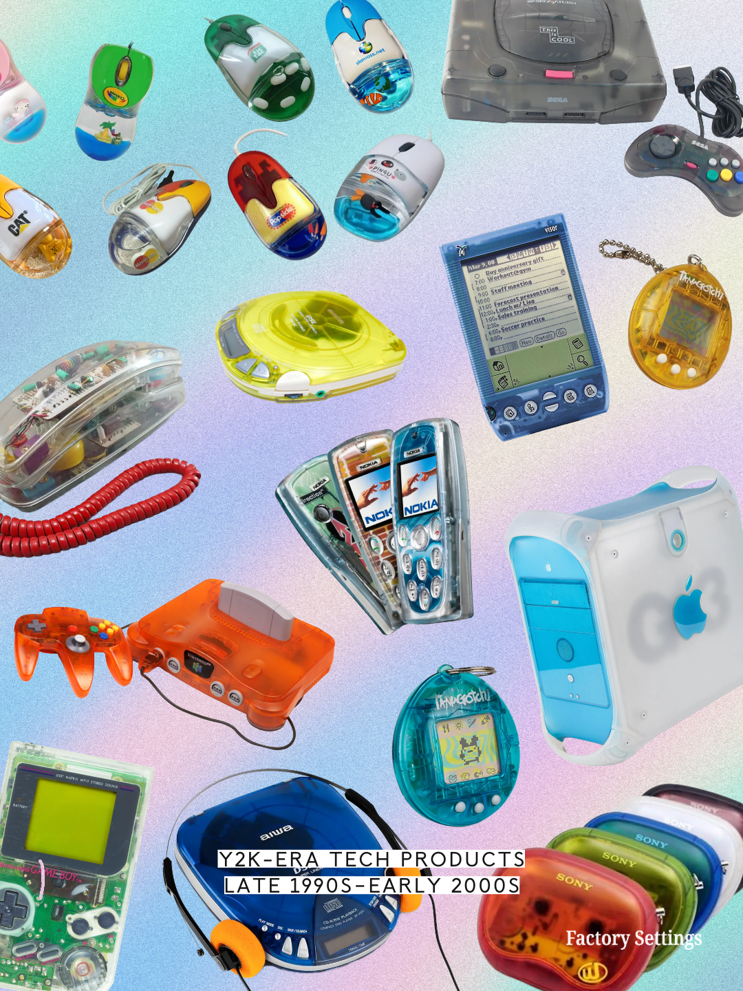
The G3 gave an emerging design language a conspicuous new centerpiece. It was not, however, solely responsible for its genesis. Nintendo’s transparent “Play It Loud” Game Boy had appeared on the market three years prior to the iMac G3’s launch, in 1995, amid experiments with colored and translucent plastics by manufacturers including Alessi and Philips. Nintendo’s Game Boy Color offered its own clear-cased, brightly-hued variation in later the same year the G3 launched, in 1998: the Atomic Purple edition housed its circuitry beneath a translucent violet shell, turning a handheld console’s internal components into part of its visual appeal.
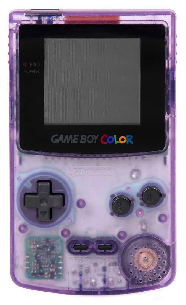
Nintendo’s Game Boy Color in Atomic Purple, 1998. Its translucent violet shell made the circuitry part of the appeal, inviting a look inside a device designed to fit in the palm of a hand.
These objects participated in Y2K tech’s defining design language, with its overlapping interests in “blobjects,” transparent tech, and playfully optimistic millennial futurism. The iMac helped popularize the combination, but its constituent qualities were distinct—a clear enclosure could be angular, and a blobject could be opaque—and the fluid form had a history of its own: the San José Museum of Art’s 2005 exhibition, Blobjects & Beyond: The New Fluidity in Design, included Marc Newson’s aluminum Lockheed Lounge, designed in 1986–88, a decade before translucent plastic reached the desktop.
Where these elements converged, the resulting aesthetic was exuberant, sometimes excessive, and unmistakably of its moment. Transparent plastic took on biomorphic silhouettes; saturated color acquired soft, almost gelatinous forms. Amoebic shapes suggested softness, familiarity, even friendliness. Splashy colors recalled candy, toys, and inexpensive novelties rather than precious precision instruments, and transparent exteriors seemed to extend an invitation, as if to say: “Go ahead, take a look inside. There’s nothing to hide here.”
The symbolic appeal exceeded what that invitation actually revealed. The equipment remained technically complex, of course, but a clear casing suggested an openness that its inscrutable, boxy, beige predecessors had denied, and in doing so it communicated a larger cultural promise: the digital revolution would be exciting, accessible, and accommodating of individual expression. It would open new worlds while somehow remaining comfortably within reach. There was an almost childlike optimism to the premise. The future looked like something you could pick up, turn over in your hands, and make your own.
Ground zero
Eventually, the novelty of personal computing gave way to its normalization. Devices diffused throughout daily life, serving less as doorways to discovery than as deeply integrated dependencies. Hardware became lighter, thinner, and less conspicuous, while ease of use and intuitive operation became the prevailing ideals.
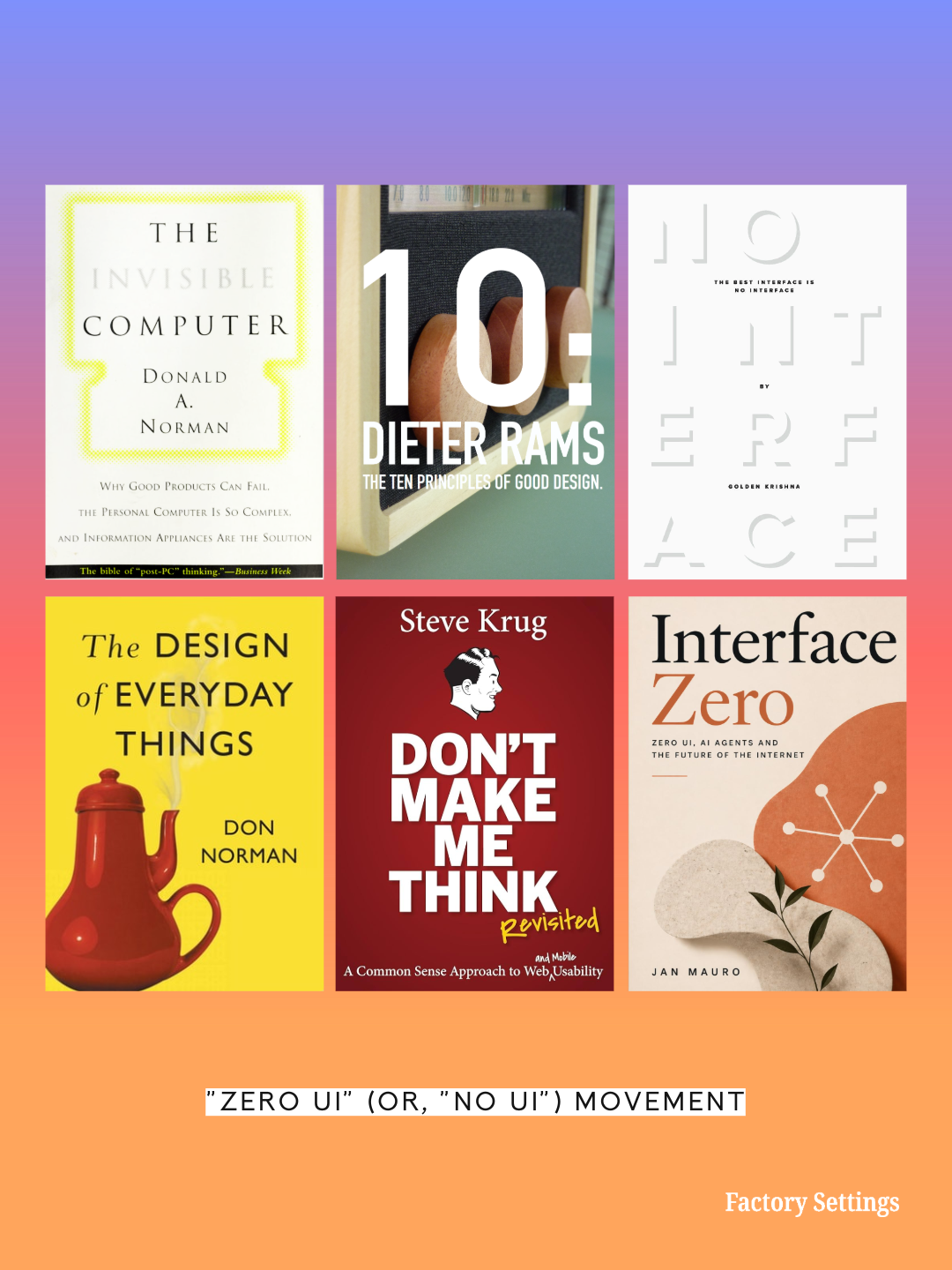
This ambition had a substantial intellectual history, predating even the popularization of Y2K tech aesthetics. In 1991, computer scientist Mark Weiser presciently wrote that “[t]he most profound technologies are those that disappear. They weave themselves into the fabric of everyday life until they are indistinguishable from it”—an ideal he acknowledged, in the same essay, “runs counter to a number of present-day trends.” In 1998, cognitive scientist and designer Donald Norman published The Invisible Computer, arguing for a future of information appliances organized around human needs rather than the complexity of general-purpose computers. Designer Golden Krishna’s 2015 book, The Best Interface Is No Interface, challenged the assumption that an interface improves usability at all, providing a key foothold for the growing “Zero UI” movement.
Apple’s evolving hardware offers a particularly legible portrait of the shift. The iMac G3’s rounded, translucent shell gave way to cleaner silhouettes and increasingly restrained materials; successive generations of smartphone design converged around expansive screens, smooth surfaces, and progressively fewer visible controls. The physical object was becoming less obtrusive, while its capabilities continued expanding.
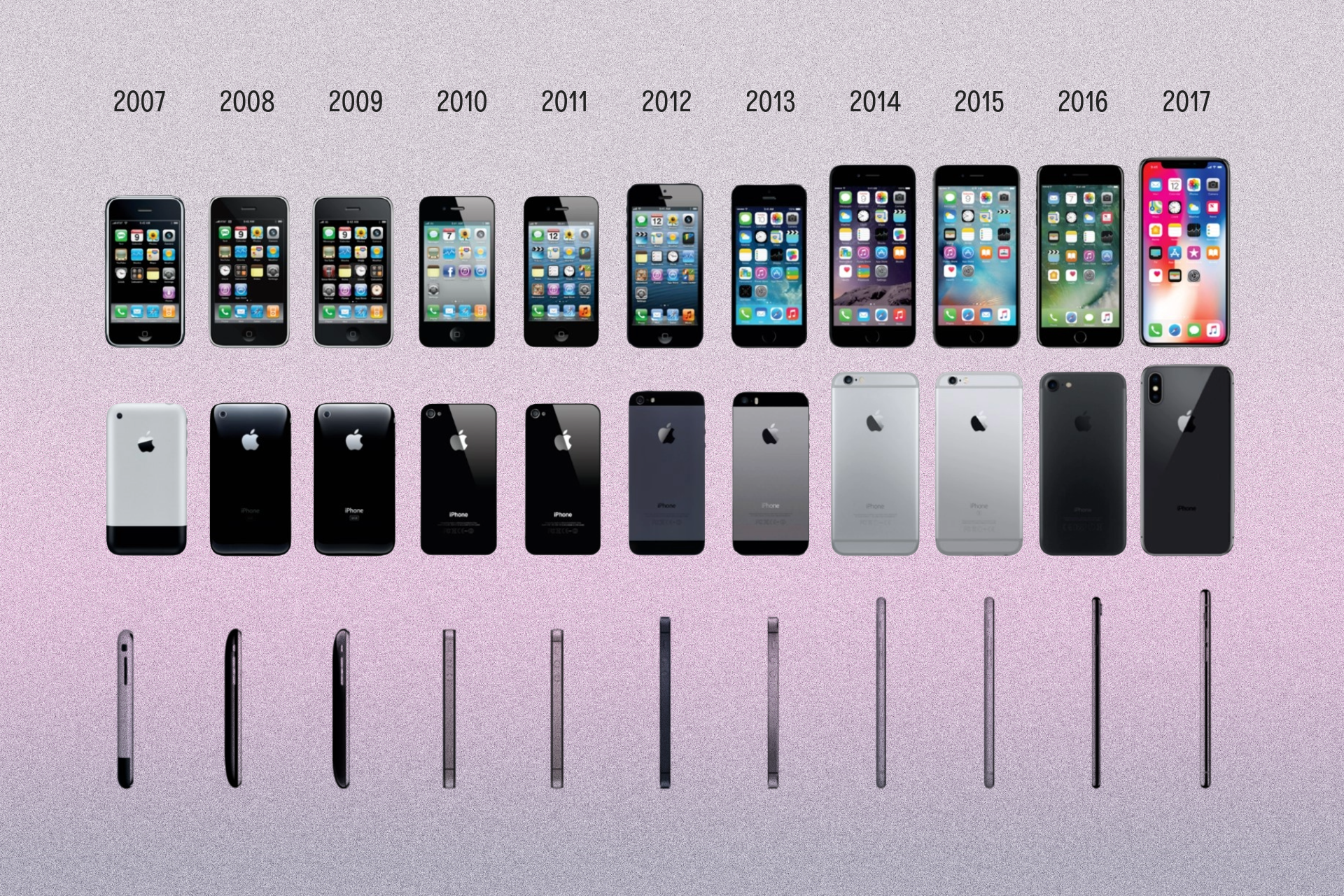
Product design evolution of the iPhone, from the original model (2007) through the iPhone X (2017).
Compelling practical considerations and technological advancements undoubtedly also backed these design developments: miniaturization, manufacturing efficiency, and usability improvements enabled smaller, more integrated, more powerful hardware. Moreover, the pursuit of “invisible interface” design rested on a well-established principle: people generally want technology to help them accomplish something, rather than force them to navigate the technology itself.
The resulting paradox was that hardware was becoming hardly conspicuous at precisely the moment when its influence over everyday life was becoming impossible to ignore.
Hiding in plain sight
By the 2020s, the internet had largely shed its earlier dependence on physical space. It accompanied us through our phones, watches, televisions, cars, homes, and workplaces, offering uninterrupted access to the digital world—and, likewise, granting the world continuous access to us. Information arrived in near real time, algorithmically ordered into a conveniently personalized digest prepared just for you. Our social spheres relocated to online platforms, where computationally curated communities connected us with others whose worldviews were compatible with our own. Software anticipated our preferences, choices, and desires (often better and sooner than we did ourselves) and automated away everyday inconveniences so efficiently, accurately, and unobtrusively that the technology monitoring, mediating, and manufacturing our individual worlds became largely indistinguishable from the world itself.
The product design ideal of “invisibility,” as a result, acquired a second, more unnerving meaning. In stripping away layers of required interaction in pursuit of “user experience,” we had eliminated not only the interface's inconveniences but also any view of the complex, nonobjective commercial and computational machinery underlying it.
Visibility of a device’s interior mechanics does not, on its own, confer understanding of the processes it performs; an algorithmic black box runs no differently—and no less inscrutably—on a smartphone encased in clear plastic than on one in matte black metal. Despite its visual messaging of transparency, visible circuitry is no guarantee of meaningful access, accountability, or control.
In its 2024 investigation into the data practices of major social media and streaming platforms, the Federal Trade Commission documented pervasive collection and monetization of detailed personal information alongside limited user control over its use—one of an increasingly common series of public revelations foregrounding the stark incongruity between the perceived triviality of an ordinary digital interaction and the scope and complexity of the invisible, largely inaccessible processes and incentives that shaped it.
The rapid advancement and adoption of generative artificial intelligence has made this disconnect starker still. We now regularly encounter digital material whose origins, authorship, underlying reasoning, veracity, and degree of human involvement we cannot establish with certainty, and as AI models grow more convincing at emulating human output and more integral to everyday life, the omnipresent black box and the generalized atmosphere of distrust surrounding it have held consumer technology squarely at the center of critical public discourse.
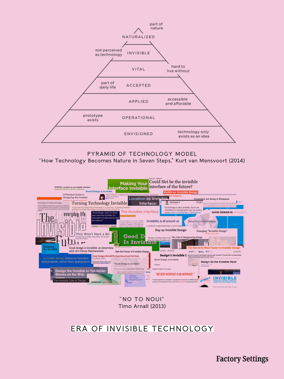
We now inhabit the digitally dependent future we so zealously cemented for ourselves while we still believed in the comfortable illusion the invisible interface enabled, and we have watched that illusion dissolve to reveal the more complicated, unsettling underpinnings we are unable to unsee. The incongruity between a device’s apparent simplicity and the complexity of the systems beneath it has become a defining tension of contemporary life.
Under these conditions, material transparency carries a different cultural charge than it did nearly three decades ago. The clear plastic casing that then suggested technological approachability now recalls a degree of legibility conspicuously absent from the systems upon which we habitually depend. Its promise has become especially compelling, while its limitations have become more obvious.
Back to the future
Blobs are back because the black box won.
The same visual language now reappears against a different cultural backdrop. Design features that would have read as futuristic to an observer in 1998 look decidedly retro to the viewer of 2026. What once evoked novelty now feels quaintly familiar, and the aesthetic attributes that once inspired us to marvel at technological complexity now supply a set of tools with which to interrogate and contest our relationship to it.
British technology company Nothing has built a recognizable identity around conspicuous hardware, see-through surfaces, and the deliberate exposure and stylization of internal components. Yet the view remains selective. Displaying hardware does not explain the software operating through it, much less the commercial systems to which that software connects; the clear case can offer the appearance of openness while leaving the larger problem intact.
Other products make different commitments. Transparent’s glass speakers reveal their construction without adopting Y2K’s hallmark bulbous silhouettes. Kickback’s Retradisc, whose clear shell lets the listener watch a CD spin, connects visibility to a tangible activity; the appeal of wired headphones similarly gives listening a conspicuous physical connection. Tin Can narrows the proposition further, combining a corded handset with Wi-Fi calling and adult-managed contacts in a device dedicated to conversation. Old-school “dumb phones” have even, likewise, regained their appeal.
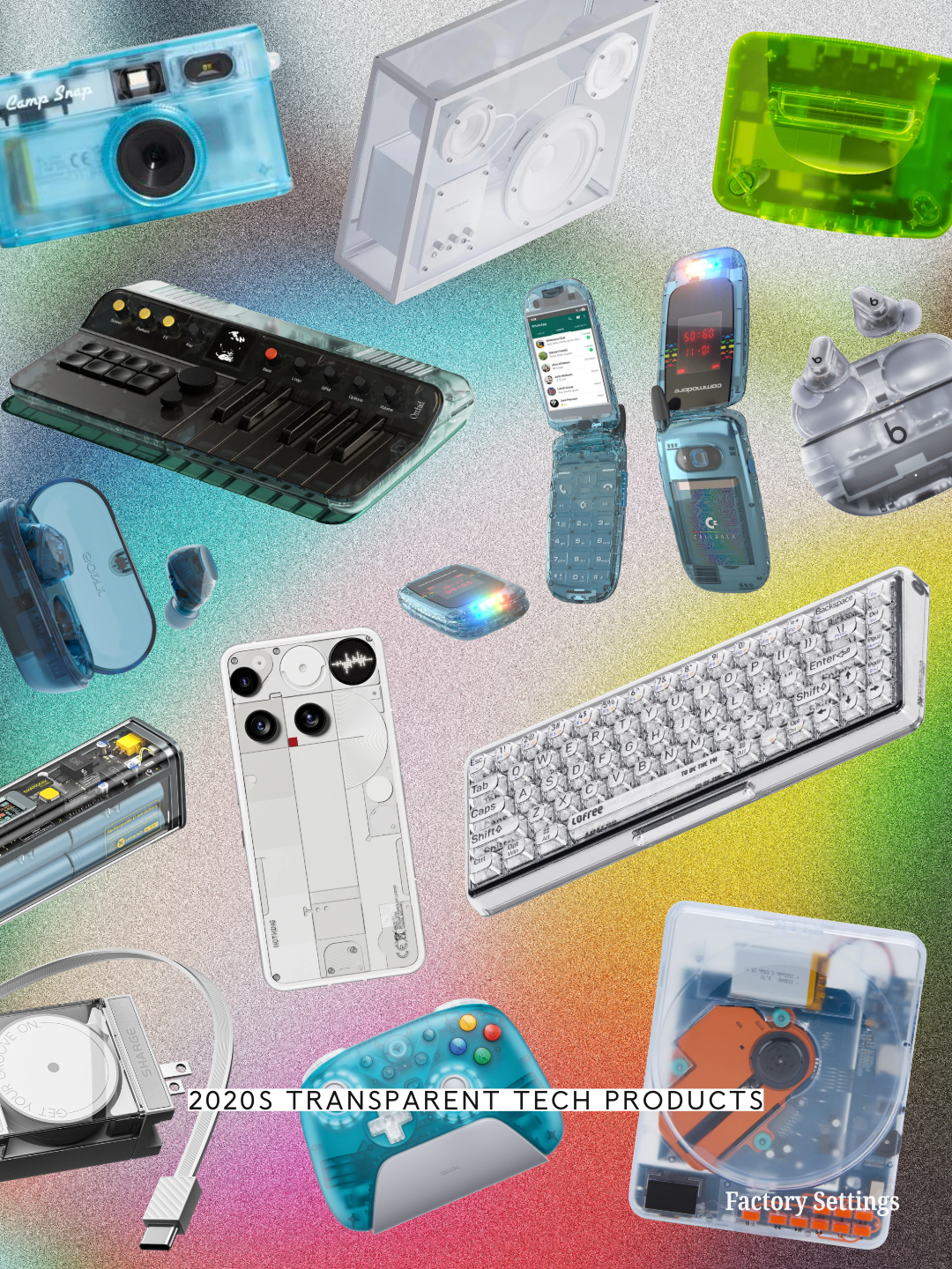
These objects do not all express the same, singular ambition, and their buyers need not share a motive. Their convergence nevertheless invites a closer look at the appeal of technology that occupies distinct physical and aesthetic space, at a moment when so much of its operation takes place beyond ordinary inspection. Their cheerful physicality offers consumers a brief encounter with an alternate cultural imagination: one in which the future remained sufficiently open-ended to be exciting, and technology still seemed capable of making the world stranger, more interesting, and more personal.
Of course, the millennium’s technological optimism deserves its share of skepticism. The digital world of the late 1990s was hardly a universally accessible utopia, nor were the dot-com era’s moguls and corporations necessarily more honest or democratic than their modern counterparts, or as transparent as the proliferation of clear plastic seemed to attest. Still, nostalgia has a way of preserving the promises of the past more vividly than its limitations, and the promise communicated by those translucent, curvilinear, candy-colored objects was unusually seductive. They imagined a future in which technology could become more powerful without becoming more alienating—one in which technological progress and personal expression were compatible, and the machinery of an increasingly digital world could remain visible, approachable, and somehow human.
Nothing’s own brand messaging captures the sentiment with unusual candor. “There was a time when tech was exciting. We looked at machines in bright colours and saw a future of new connections and new ways of engaging with the world,” the company’s “About Us” page reads. “But everything is the same now. We’re bored.” Its stated approach—“making tech fun” by “creating bold, beautiful and unusual designs for products and software that aid creativity”—feels familiar, but its aspiration is pointedly different from that of its millennial forebears. The past’s pursuit of innovation for its own sake has, in the decades since, lost its luster. What we now seek to recover from the Y2K era, in returning to its aesthetic blueprint, is that moment’s capacity for “imagining a different, better future for humanity.”
The objects themselves are artifacts of a remarkably specific cultural moment, and while their revival maps neatly onto the cyclical swing of the nostalgia pendulum, it also asks what, specifically, our present nostalgia aims to relocate. Any nostalgic resurgence is a selective reconstitution through a contemporary lens, and in our imperfect reconstructions of an idealized and inaccessible past—the aspects we choose to resurface and those we omit, the revisions we make, that which we faithfully preserve—we reveal a clearer picture of what defines our collective experience at this precise moment in time.
Perhaps, here, what we are revisiting is the last moment we can recall before the future on our horizons became our present reality, and familiar enough to disappoint us; before the technological revolution’s possibilities hardened into the prison of platforms, products, subscriptions, and systems of dependence we inextricably inhabit; and the open-ended excitement of discovering a brave new digital world was complicated by the inevitable experience of inhabiting one.
We return to the clear, colored case because we still want what it was selling: the possibility of a future we can trust, shape, and anticipate with hope, wonder, and imagination.

